Inspiring Positive Climate Action

Sustainability, though critical, is often seen through a lens of doom and gloom—cold, clinical, and overwhelmingly complex. Earthfest, a free, community-powered sustainability festival in the heart of London, wanted to challenge that perception. They aimed to inspire meaningful action not through fear or shame, but through celebration, creativity, and human connection. The brand needed to reflect this fresh, optimistic perspective—breaking out of the echo chamber to welcome a diverse audience, from eco-conscious consumers to curious newcomers. LoveGunn was tasked with transforming Earthfest into a compelling cultural moment: bold, inclusive, experiential, and hopeful.
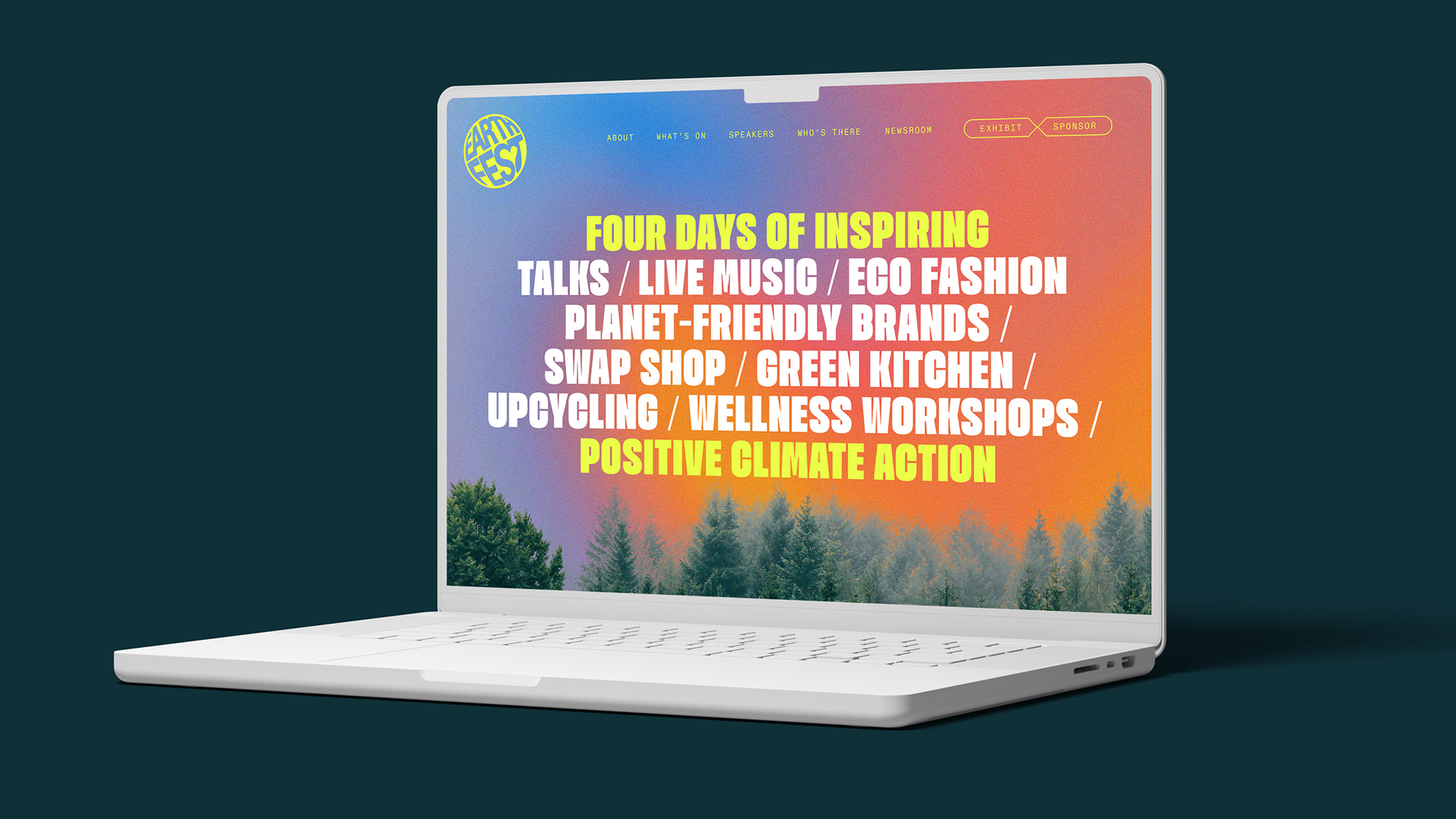
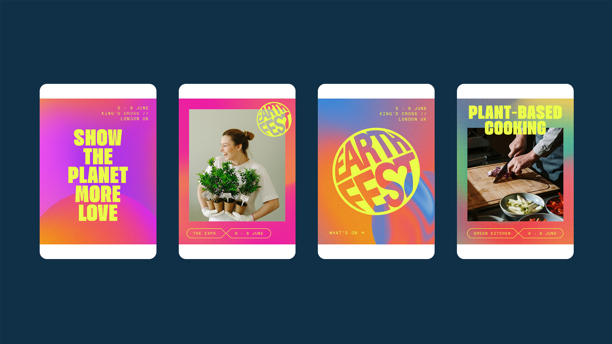
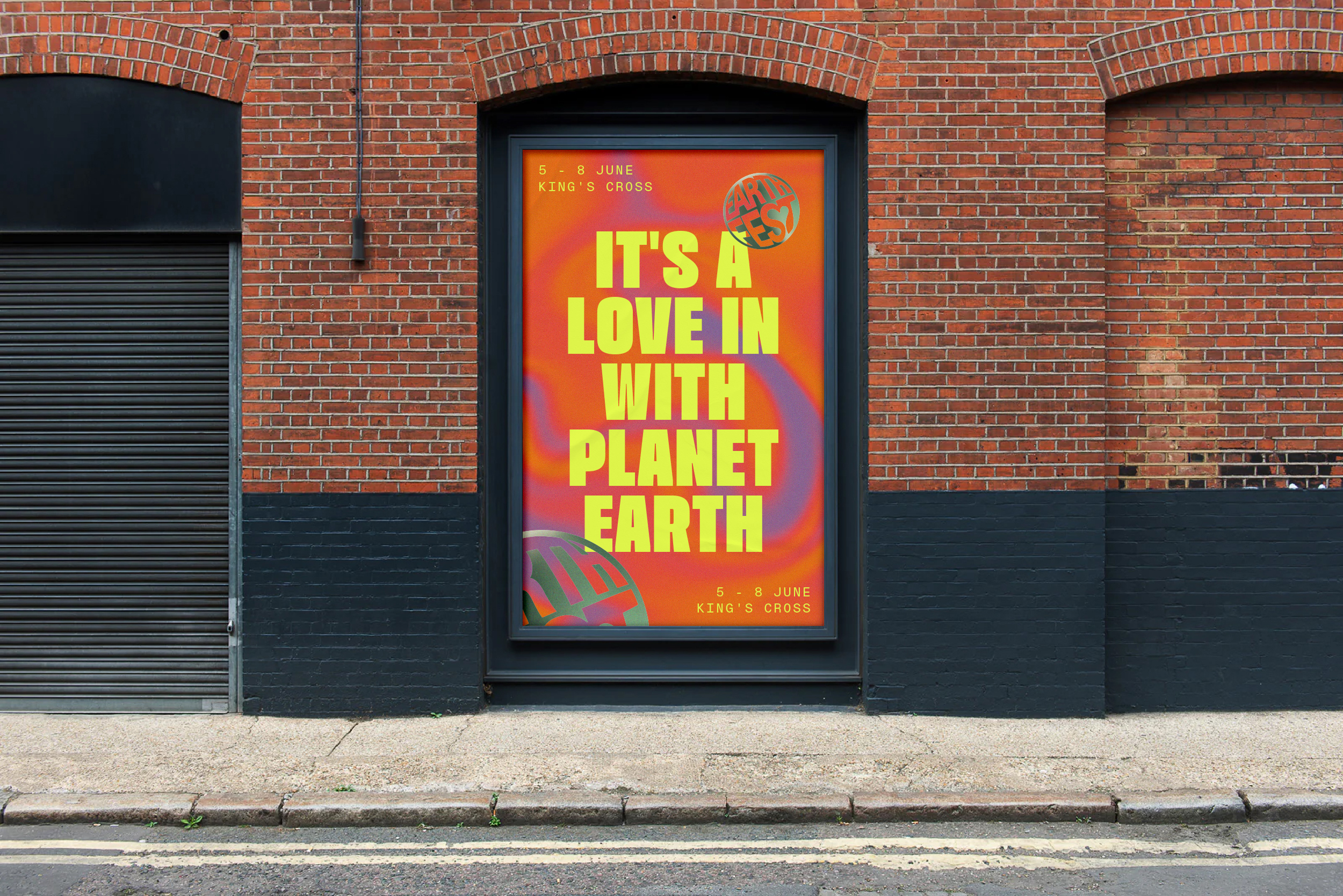
LoveGunn reimagined the Earthfest identity by embracing a bold, psychedelic visual language—drawing on the rebellious optimism of 60s counterculture to reflect a new kind of climate movement: one that’s joyful, inclusive, and rooted in human connection. By shifting away from fear-driven narratives and corporate greenwashing, the brand champions sustainability as a lifestyle worth celebrating—vibrant, emotional, and radically accessible.
The branding strategy centred on evolution—moving away from traditional sustainability tropes and toward an aesthetic that celebrates action, lifestyle, and togetherness.
The brand would amplify Earthfest’s mission: to unite business, culture, and community in a movement that is joyful, inclusive, and human. The creative expression needed to reflect the energy of a grassroots revolution, while being flexible enough to serve both B2B and B2C audiences.
By focusing on accessibility and emotional engagement, the visual identity was designed to open the door to new audiences, helping Earthfest become a platform for learning, sharing, and transforming how we talk about sustainability.

At the core of the system is a distinctive psychedelic gradient style, used as overlays on photography, illustrations, and layout backgrounds—imbuing every asset with the Earthfest essence. These gradients represent more than aesthetics: they reflect time, mood, and movement, offering visual diversity while maintaining brand consistency.
The typography is loud and proud. It commands attention and reflects the boldness of the cause and the energy of the crowd. ABC Diatype Mono is used to frame important messaging, giving structure and rhythm to the content.
A flexible color palette inspired by natural cycles supports modularity and scalability, allowing for the development of sub-brands and themes across different stages, zones, or content pillars within the event.
Together, these elements create a cohesive system that turns the Earthfest experience into a fully immersive, emotionally resonant brand world—one that invites everyone to celebrate sustainability as a vibrant and vital part of modern life.